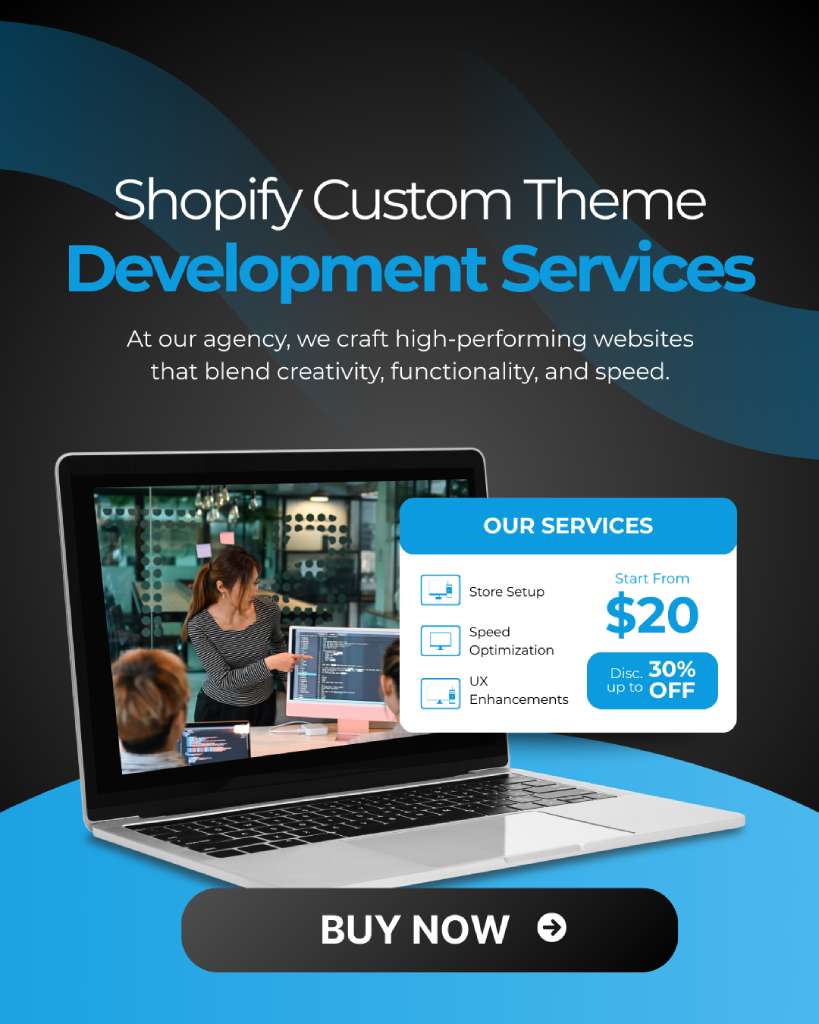


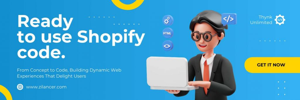


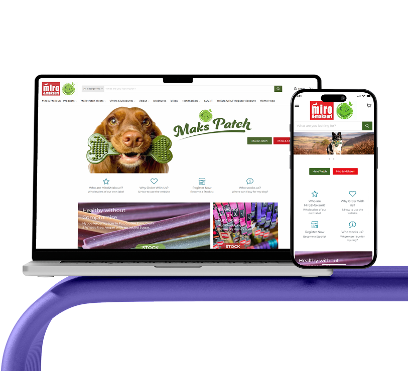
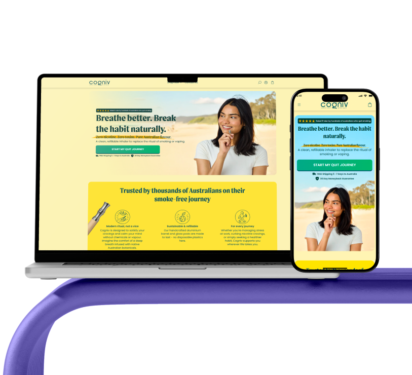
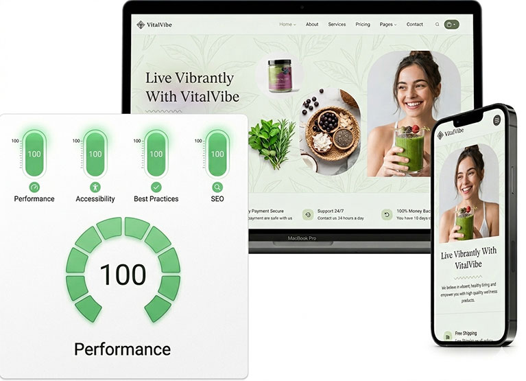
Since 2012, Zilancer LLC has specialized in crafting high-quality, customizable Shopify themes. From consultation to launch, our team is professional, detail-oriented, and responsive. We focus on both design and performance—optimizing every theme for user experience, SEO, and conversions. If you need a reliable Shopify theme development agency, Zilancer delivers results.
Learn More
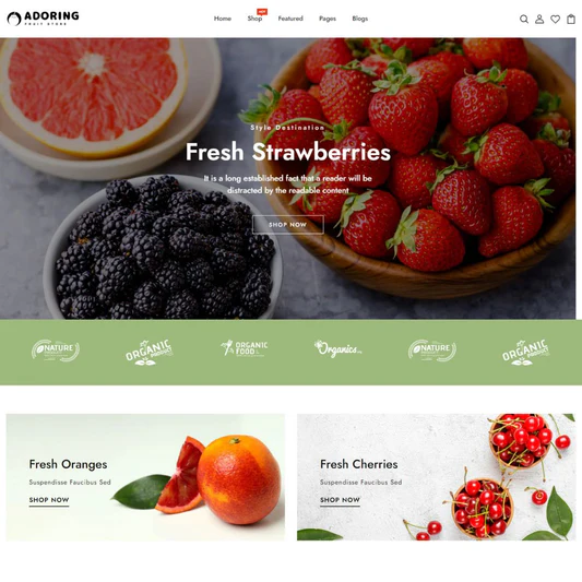


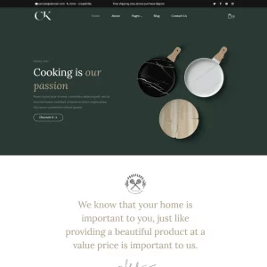
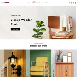
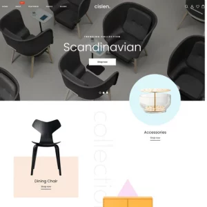
Related products
Sale!